Did you know that 1 in every 26 customers complain when they are unhappy and the rest just churn without ever raising a complaint or leaving negative feedback?
This just goes to show that more often than not organizations don’t pay attention to closing the feedback loop with their customers, resulting in customers churning out silently. This doesn’t just affect the reputation of the company but also impacts its growth and revenue – it costs 5-25 times more to onboard a new customer than to retain an existing customer.
The challenge however that businesses are facing is
- Either they don’t know that their customers are about to leave them
- Or they know that their customers are unhappy but they don’t know ‘why’
Mostly, it is the second case!
(But, if you fall in the first category, not knowing if your customers are about to leave you, then it’s high time for you to launch an NPS program!)
And like the majority, if you as well face a challenge in identifying the drivers of customer churn, then this blog is for you.
What is a Churn Dashboard?
Customer Churn dashboard tells you which part of the customer journey they are struggling with the most and why!
Imagine gaining a bird’s eye view of the different aspects of your customer account – who is happy, who is dissatisfied, who is about to leave, doesn’t that sound fantastic? Gaining an overview of your CX strategy and taking action in time?
Yes, that’s exactly what a customer churn dashboard does.
It gives you an overview of different aspects of your customer account, enabling you to track important CX metrics and KPIs and giving you a better understanding of what is working and what is not working in your CX strategy. Businesses can track important metrics like churn rate, customer retention rate, NPS, etc to understand their churn rate, and the reasons behind it and ultimately avoid churn.
But Why Create a Churn Dashboard?
Before jumping into creating your customer churn dashboard, you first need to understand why you need one in the first place. Here are a few reasons why you need to build a churn analysis dashboard.
- Identify Churn Pattern: You can easily identify recurring patterns and themes related to customer churn such as the behavior of certain customer segments that are more prone to churn or when churn rates are particularly high, etc.
- Improve Retention Strategies: By leveraging actionable insights into why customers are leaving, you can create targeted strategies to improve your customer retention such as creating personalized offers or discounts, improving customer service, etc.
- Predictive Analysis: With a churn dashboard you can easily identify which customers are likely to leave in the near future. This enhances decision-making with actionable insights that are not just historical but forward-looking, enabling proactive action to retain at-risk customers.
- Increased Revenue: Reducing your churn rate has a direct impact on your bottom line. According to the book, Marketing Metrics, businesses have a 60-70% higher chance of selling to an existing customer, while the chances of selling to a new customer is only 5-20%.
Customer churning out and you have no clue why? Sign up today to SurveySensum and get expert CX consultation from top CX experts and identify our key drivers, do impact analysis, and take prioritized action to stop customer churn.
Free Forever • No Feature Limitation • No Credit Card Required • Get a Live Demo ![]()
Now that you know why creating a churn dashboard is important, let’s understand which data you need to track and which elements you need to use for a better visualization.
How To Create a Churn Dashboard? (Key Visualization Elements To Include)
Here are the key visualization elements to include in your churn dashboard.
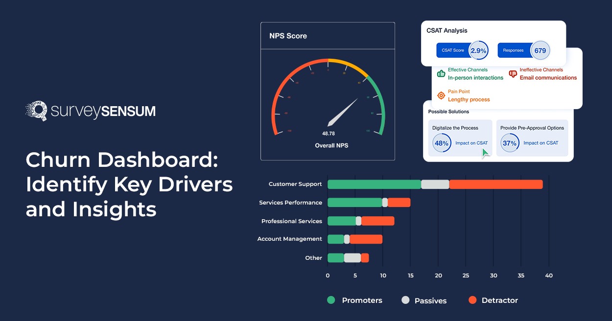
1. The NPS Lifecycle Visualization
The NPS lifecycle widget helps you analyze the health of your top customers by segmenting them based on responses/non-responses and financial spending. With this widget, you can gain insight into what percentage of customers contribute the most to business and whether or not they are at risk” of churning out. By gaining this understanding you can easily identify top patterns, trends, and complaints and improve your strategy accordingly.
2. NPS Text Analysis
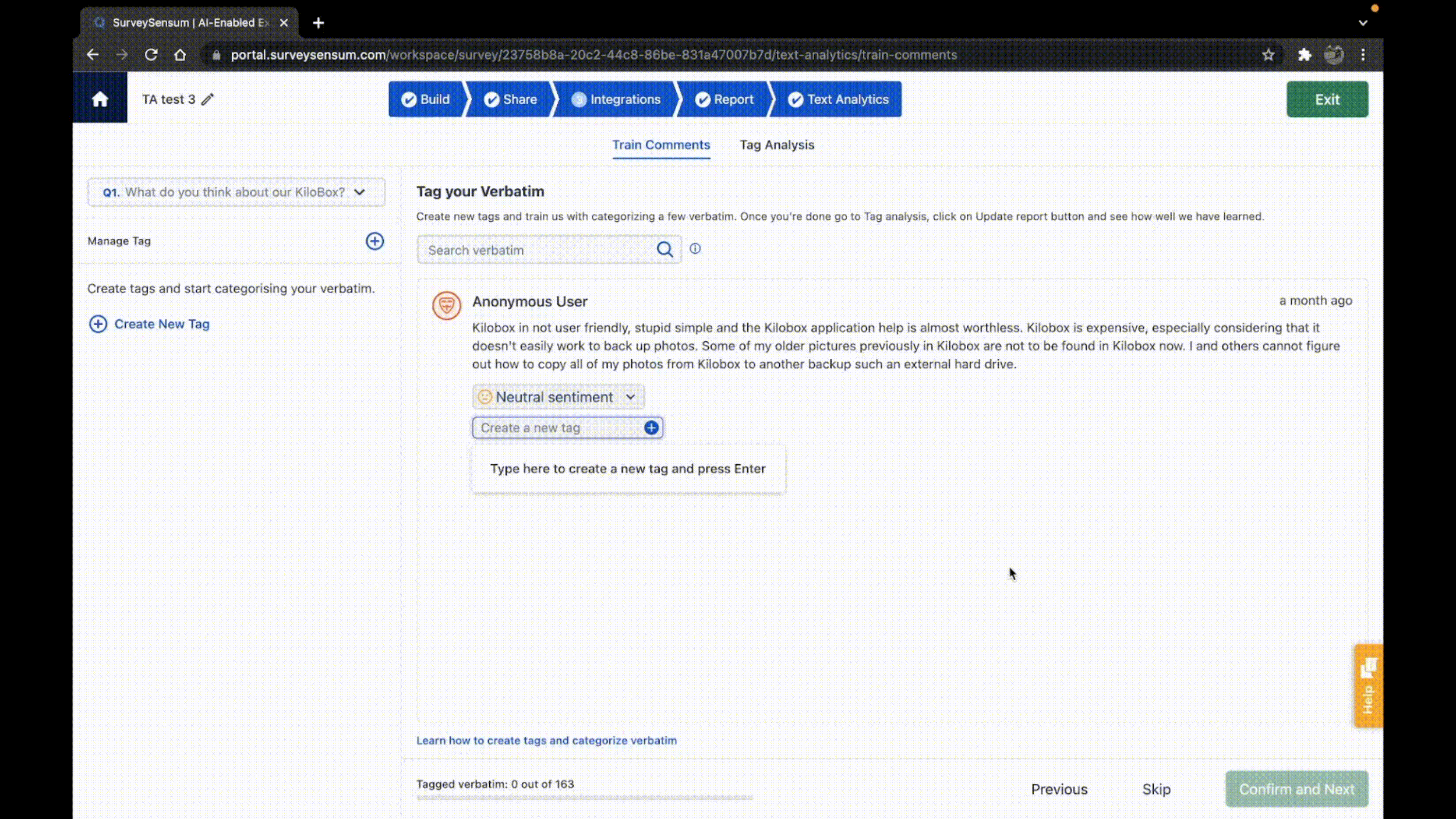
With NPS text analysis, you can visualize which common words or phrases are most used by your customers in NPS surveys. This visualization provides you with a quick overview of recurring themes in customer complaints.
For example, the word “user interface” was used by 20 customers with 15 in negative emotion and 5 in neutral, this clearly indicates that there is some issue in the product’s user interface that the company needs to take immediate action on.
3. Key Drivers Identification
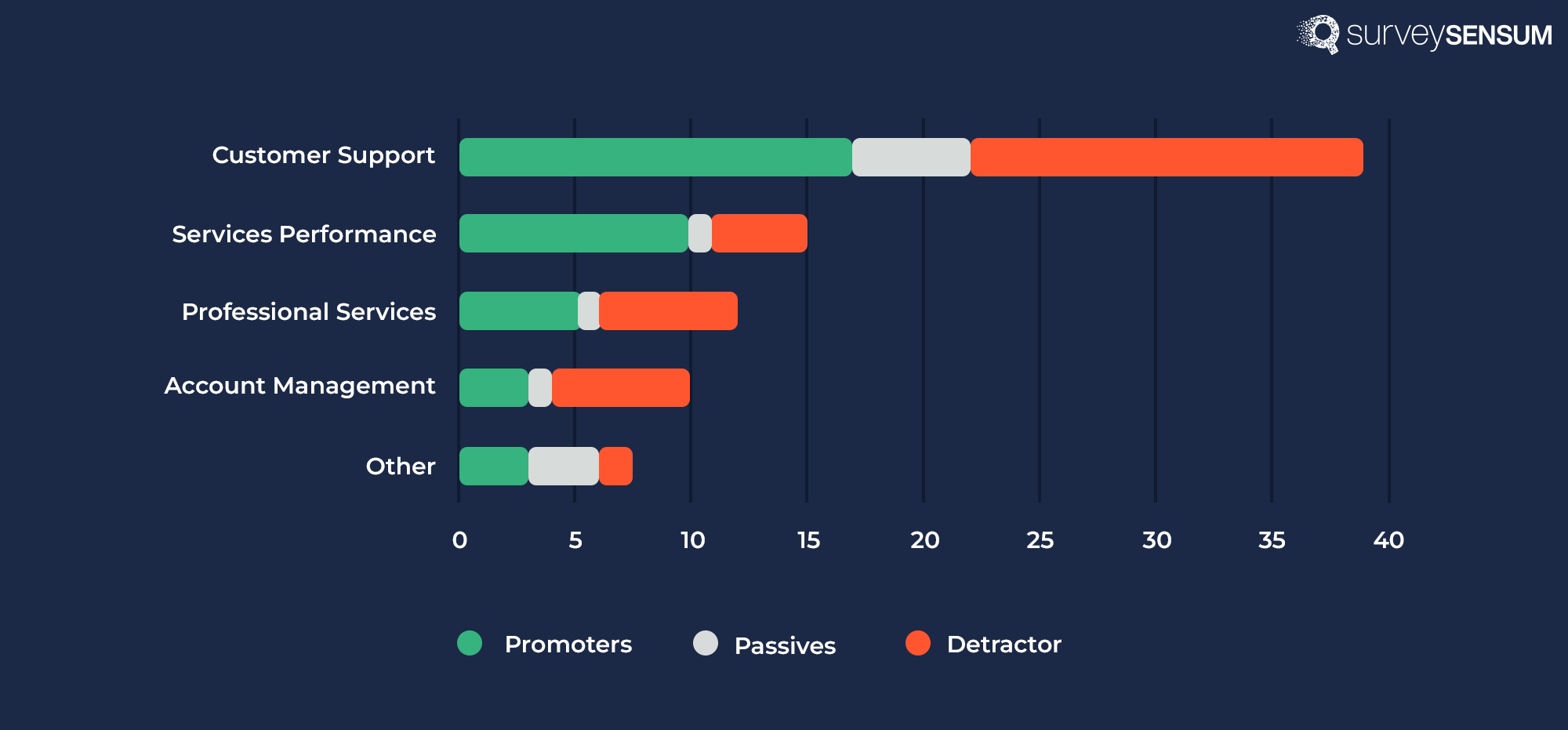
Before resolving issues related to customer churn you need to identify the key drivers which are impacting your churn rate. With this widget, you can easily identify the top customer complaints, trends, sentiments, and patterns.
4. Impact Analysis
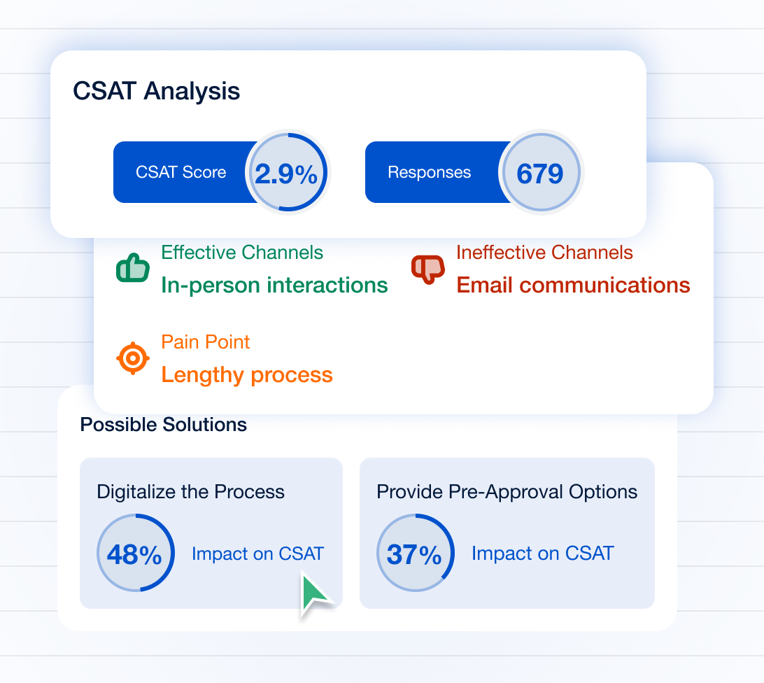
You have identified your key drivers but cannot possibly take action on each one of them. This is where impact analysis is needed. By analyzing the impact percentage of each driver on your bottom line you can take action in a prioritized manner and close the loop effectively.
5. NPS Categories
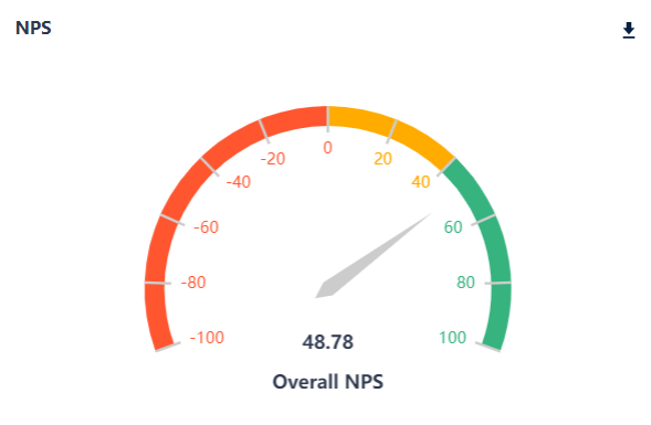
With NPS performance gauge you can segment customers into different categories – promoters, passives, and detractors, based on their NPS responses. This enables you to get an overview of which percentage of your customers are about to leave (detractors), which percentage is at risk of churning (passives), and which percentage is genuinely happy with you (promoters). This segmentation will help prioritize your action plan – from detractors to promoters – instead of randomly taking action.
Conclusion
Gone are the days when customer experience was something companies could afford to look over. With companies turning up left to right, it is not only important to create a positive experience for your customers but also to take proactive steps to keep them satisfied and avoid any potential churn. By creating a churn dashboard you are not only tracking important CX metrics but also enabling yourself to become proactive in creating better experiences for your customers.
However, analyzing and tracking anything requires a robust tool and with a CX tool like SurveySensum, you can create an analytical churn dashboard that is completely customizable to your needs. Not only that, the tool also comes with expert CX implementation and implementation support so that you track the right metrics and KPIs, identify your key drivers, and close the feedback loop in real-time, enabling you to take proactive steps to avoid churn.
Create Your Customized Analytical Churn Dashboard Today With SurveySensum!
Free Forever • No Feature Limitation • No Credit Card Required • Sign Up For Free ![]()

Increase ROI by 3x with targeted feedback & analysis
Boost Customer Satisfaction by up to 20%
Reduce Churn by identifying pain points in real time
See it in Action
How much did you enjoy this article?