


Did you know that by 2025, 3.7 billion, or nearly three-quarters, of all internet users worldwide will only use their phones to access the web? These overwhelming statistics prove that the world is changing, and we need to take mobile optimization seriously.
Mobile users are time-pressed people. They access websites to find information and products on the go. Traditionally, this audience wasn’t of much interest to business owners. Why? The purchase intent of such website visitors was lower than that of the desktop ones. People use smartphones for browsing goods and services while buying from laptops and PCs.
But this tendency is rapidly changing towards the growth of m-сommerce. Now, it’s critical to provide the best user experience from mobiles because these prospects want to have the website available at their fingertips and buy right away.
What is the journey of mobile buyers? They enter the website or app, see the home page, look for the desired product, read its specs, and add goods to the cart or purchase software. Your task is to ensure frictionless browsing.
From creating responsive websites to launching apps, online businesses choose a mobile-first approach more and more. Partnering with a meta ads agency can also help brands tailor their advertising for mobile platforms, reaching audiences where they spend most of their time. In this guide, we’ll look at five strategies for making your company mobile-friendly.
In this guide, we’ll look at five strategies for making your company mobile-friendly.
Five Strategies to Optimize Your Online Business for Mobile Users
1. Optimize for Speed and Performance
Loading speed is crucial for keeping visitors on the page. Imagine patiently waiting for a website to load on a phone. Does it sound intriguing, considering consumers can close the page and switch to another business? We bet it doesn’t, so you lose a significant number of potential customers. This is also why tracking mobile rankings matters. When your site loads slowly on mobile devices, it can hurt your position in search results, making it harder for potential customers to find you.
While there is a golden rule of striving to keep the website speed not more than 3 seconds, digital moguls fight over milliseconds. In fact, Amazon found more than ten years ago that every 100ms delay in load time cost them 1% in sales.
That strikes right at the bottom line, demonstrating how important speed is. Since then, consumers’ attention spans have gotten shorter, and their impatience has only grown. Therefore, even the slightest delay can cause a considerable decrease in user engagement.
To ensure the website is up to the mark, answer the following questions and take some concrete steps:
- Can you reduce the image size without losing quality? Sometimes, photos may be unnecessarily huge, creating a severe load on the server. Use tools like TinyPNG or ImageOptim to compress them for speedier loading. Don’t be afraid: They compress files without compromising the quality.
- Can you minimize HTTP requests? Each HTTP request made by the webpage (like images, scripts, and stylesheets) adds to loading times due to imposing strain on the server and retrieving each element separately. Simplify design elements and merge files where possible to ensure better mobile performance.
- Do you leverage browser caching? If not, users open the website each time, like it’s their first visit. All elements load from the beginning, even if people have already accessed them. The solution is to employ caching, i.e., storing parts of the site in the user’s browser for their next visit. Tools like W3 Total Cache help set this up for WordPress sites.
- Do you enable compression? Using the file compression application Gzip, you can drastically minimize the size of CSS, HTML, and JavaScript files.
- Do you trust web hosting? While you may be satisfied with the chosen provider, check whether it measures up to performance standards. If the site is consistently slow, switch to another vendor or upgrade the hosting plan. You can also run a vulnerability assessment to detect hidden security issues that might be affecting performance.
- Do you distribute the content efficiently? Content stored closer to the end user will load faster. That’s where content delivery networks (CDNs) may help. They distribute the content across multiple servers worldwide, reducing the distance to the user and speeding up load time.
- Have you reviewed the code? CSS, JavaScript, and HTML may contain unneeded characters, and removing them can improve the site’s load time. Don’t analyze the code manually. Use tools like CSSNano and UglifyJS to automate the process. You can also rely on no-code tools, such as Webflow, which, unlike WordPress, writes semantic and clean code as you design.
2. Guide Users with Ease and Accessibility
Navigation is another crucial aspect of a pleasing user experience on smartphones. The mobile screen space is limited, so there should be a clear path from the landing page to purchase. It’s like having a well-structured map with understandable directions. If users can’t find their way, they’ll bounce. That’s where you need to conduct an unbiased UX site audit to identify navigational hurdles. If there are some, consider these tips for smoothing out the digital route:
- Create the navigation menu like a good book index—straightforward, concise, and leading right to the point. It includes cutting down on excessive menu options, using plain language without fancy jargon, and breaking down categories into logical subcategories.
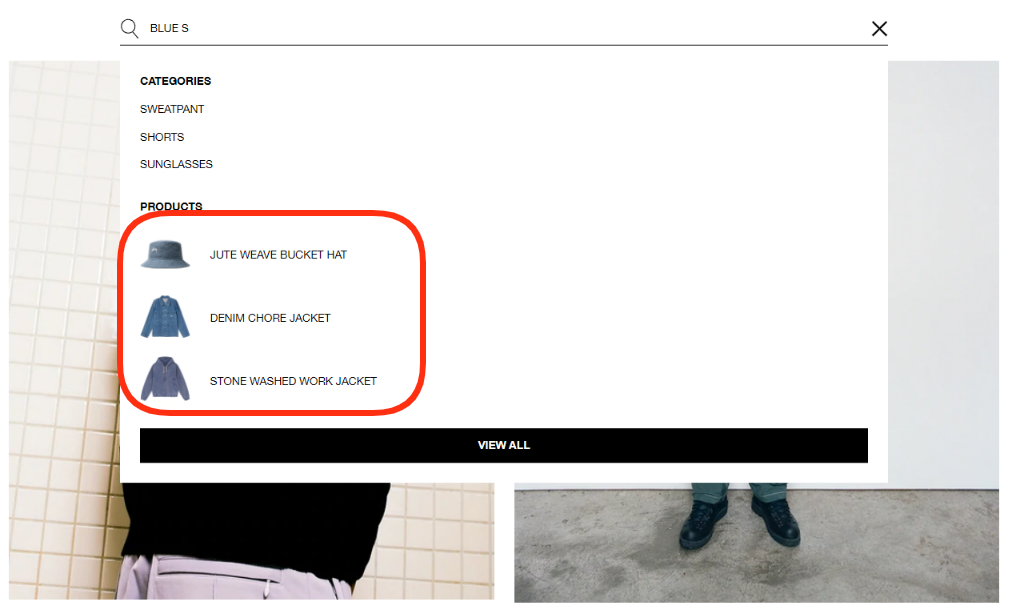
- Employ on-site search with predictive capabilities. Incorporating a search bar is convenient for locating the desired page. Employing advanced search features like auto-suggestions is even greater. The search may complete the query, provide related results, or display the most popular products.
- Make the website accessible to everyone. Make use of hues that contrast with one another. Keep the font size legible to save visitors from squinting. Describe images with alt text so that people can read about their contents when photos can’t be displayed.
3. Design Surveys for Seamless Mobile Experiences
One of the easiest ways to ensure the mobile experience satisfies the target audience is by asking users directly about their opinions. That’s where feedback collection is necessary. You can do it in various formats, including offering visitors to take a survey. Question them about their preferences, pain points, and other information to make the mobile UX more pleasing. When you hire dedicated app developers, they can help you integrate in-app feedback forms or prompts, allowing businesses to create seamless and convenient opportunities for users to share their thoughts, rate their experiences, and provide valuable comments in real-time without leaving the app.
Now, let’s zero in on survey design in line with mobile optimization best practices. The survey may look good on the desktop version. But on a smartphone, a lot can go wrong. Imagine pinching, zooming, and tapping on tiny checkboxes. Considering a soft launch in 2024 for mobile applications is invaluable, enabling developers to optimize the user interface and overall experience based on direct user feedback before the full release. If you’re planning a new app or updating an existing one, thoughtful mobile app development plays a crucial role in making sure these optimization efforts are built-in from the start. It doesn’t have to be this way, so follow these rules:
- Keep the form short, taking a couple of minutes to complete. Users are likely multitasking, maybe waiting in line for coffee or sitting on a bus. Don’t interrupt them.
- Include big buttons and bold choices. It’s frustrating to tap the wrong response option, so increase their size and space out to minimize the risk of selecting the wrong one.
- Avoid cluttering the survey with unnecessary elements. It’s like a well-organized closet—everything should be easy to find, and there’s room to breathe.
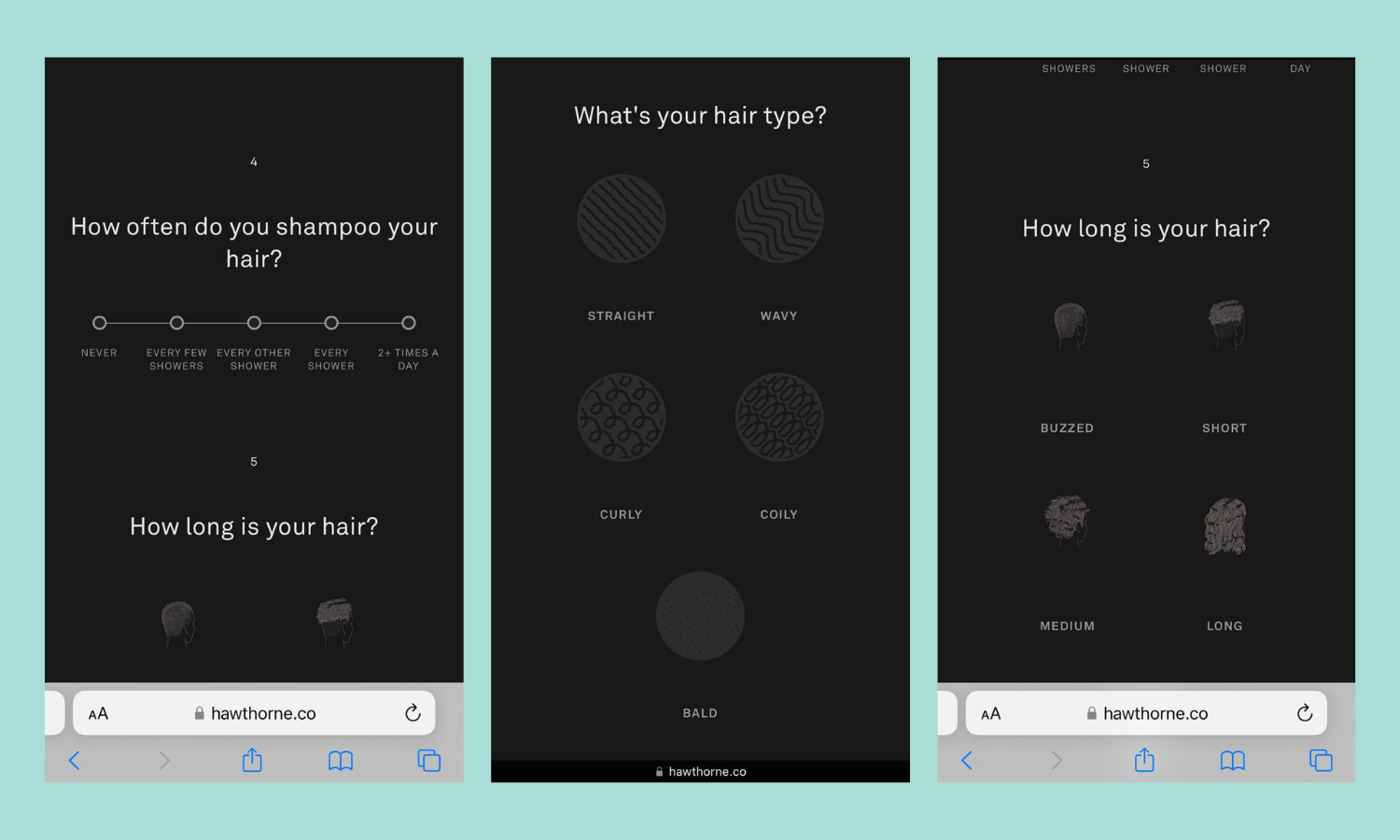
Below is a wonderful quiz example on the Hawthorne store. You don’t have to think much—just tap the best-suited answer.
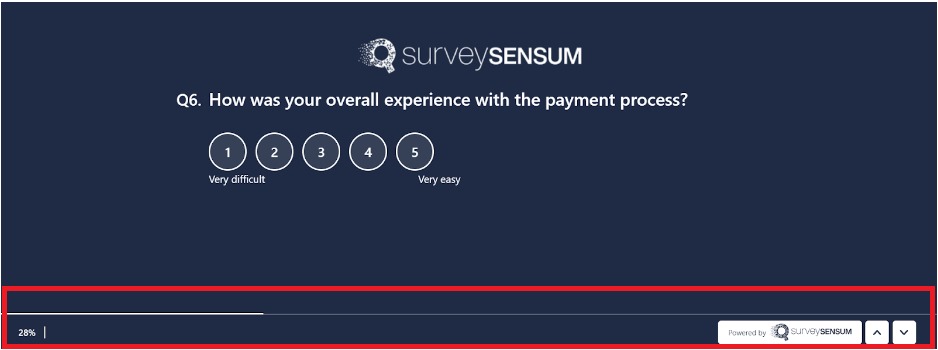
The rule of seamless navigation also applies to surveys. So, create short surveys, or show the progress indicator. Inform users of their progress and how much is left.
Extend accessibility to polls as well. For instance, voice the questions and support voice input to create a conversation instead of filling out a form. Just like with the website layout, color contrast and readable fonts in the form make it more user-friendly, including for people with visual impairments. Utilizing book fonts can further enhance readability, especially for individuals with dyslexia or other reading challenges, ensuring inclusivity in accessing information and participating in polls.
Instantly confirm that the poll is completed. Show appreciation and encourage future participation to enhance the respondent’s overall experience and the survey’s effectiveness.
Start Creating Well-Designed Surveys with SurveySensum
Free Forever • No Feature Limitation • No Credit Card Required • Get a Live Demo 
4. Master Mobile SEO: Expand the Reach, Enhance Visibility
The reason why we talk about search engine optimization in the context of mobile-friendliness is that Google relies on mobile-first indexing. Websites optimized for mobile devices not only rank higher but also experience up to 40% higher conversion rates. So, it’s critical for the website to be designed for mobile if you want to appear in the highest positions of search results, especially when considering SEO costs for small business. What can you do?
First and foremost, adopt responsive design. We’ll discuss what it means in the following section.
Then, speed, speed, speed. We’ve talked about this, but it’s worth repeating. A fast-loading site is essential for SEO, as speed is a Google ranking factor. At last, optimize meta information (tags, titles, and descriptions) for smaller mobile screens.

Get local if your target audience is right around the corner. Create a Google My Business profile, claim the listing, and keep it updated. Encourage and respond to reviews. Local SEO thrives on them. Use local keywords and if you need expert guidance, consider a local SEO service to help optimize your strategy.
For example, a tea shop in Austin selling butterfly tea will benefit from capitalizing on the “best Austin butterfly tea” keyword.
5. Embrace Responsive Design
Picture this: you’re lounging on the couch, phone in hand, browsing the web. Do you ever notice how some sites fit perfectly on the screen while others require swiping and zooming like you’re trying to solve a puzzle? That’s responsive design in action, the foundation of mobile optimization. Sadly, not all websites can boast of having it.
Responsive design equals flexibility, with one layout fitting all devices. All of the website’s elements should resize, adjust, and stretch to look perfect whether a user is viewing it on a desktop, tablet, or phone. It happens thanks to a fluid grid layout.
Don’t forget about adaptable images, too. They shouldn’t get distorted or lose quality when they enlarge or contract to take their place on different screens.
Another critical component of responsive design is media queries, which are part of a website’s CSS. Developers write them when coding website frontend and represent specific conditions about screen size. They tell the browser:
- which CSS styles to apply on what device;
- whether it should go with the default styles;
- whether it should look for other media queries that match the current conditions.
The result is a responsive and user-friendly experience across various touchpoints.
Remember these key mobile design tips:
- Choose minimalistic looks over cluttered and rich with elements designs.
- Test the website with varied tools to make sure it adjusts to desktop, mobile, and other devices.
- Place buttons in the thumb-friendly zone and make them easy to tap.
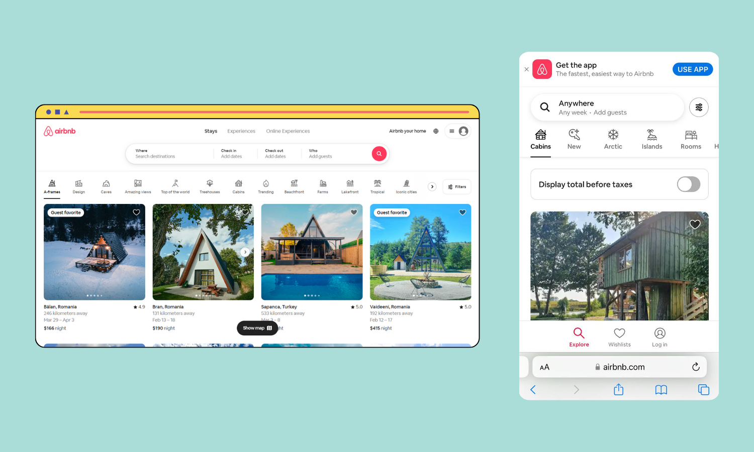
To get a better understanding of the principles discussed above, take a glance at the Airbnb website viewed from a laptop and smartphone. As you can observe, browsing listings is a breeze. Images resize, text reflows, and the booking process is seamless.
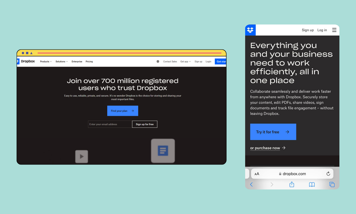
Another excellent case in point is Dropbox. It represents a model of clean design done right. It’s like water—it just flows into whatever space it’s in.
To Sum Up
We’ve covered five pivotal strategies for going mobile-friendly to win over smartphone users and convert them into customers. From the lightning-fast load times to the sleek, responsive design, these are the steps that improve the mobile UX and even website rankings.
Make the site easy to navigate, streamline feedback collection, and attract the mobile audience with SEO optimization. Listen to the voice of the customer by asking about their impressions of your site. Learn the recent mobile UX requirements, and always be ready to tweak and improve. We hope this guide will help you start your journey to a thriving business.
Get Started with SurveySensum
Free Forever • No Feature Limitation • No Credit Card Required • Sign Up For Free 

Increase ROI by 3x with targeted feedback & analysis
Boost Customer Satisfaction by up to 20%
Reduce Churn by identifying pain points in real time
See it in Action
Contents
How much did you enjoy this article?